Brand identity · Packaging
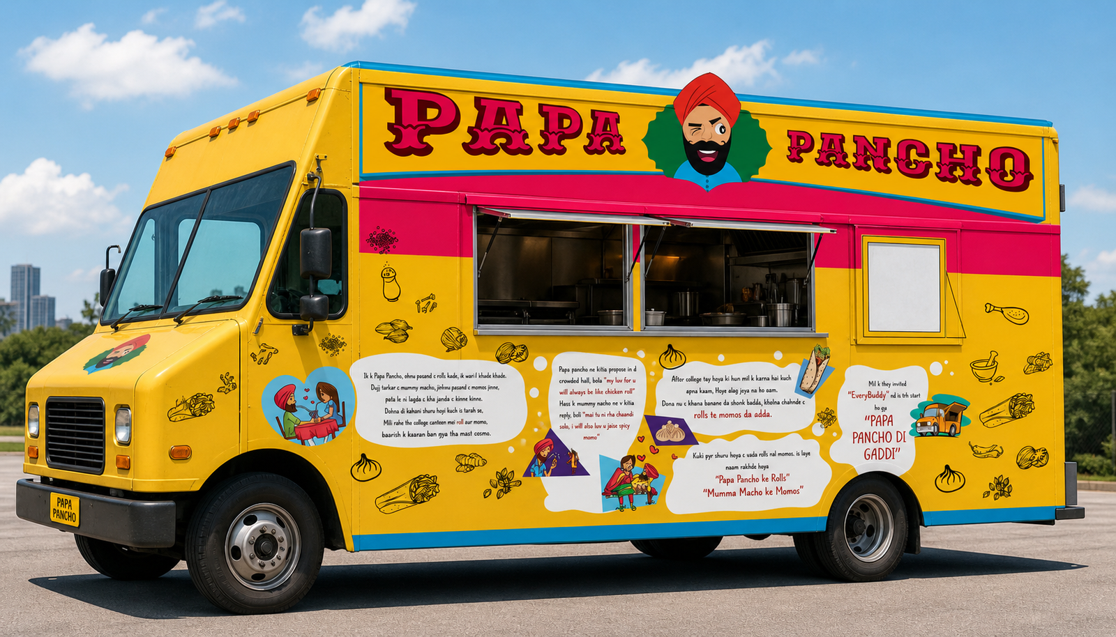
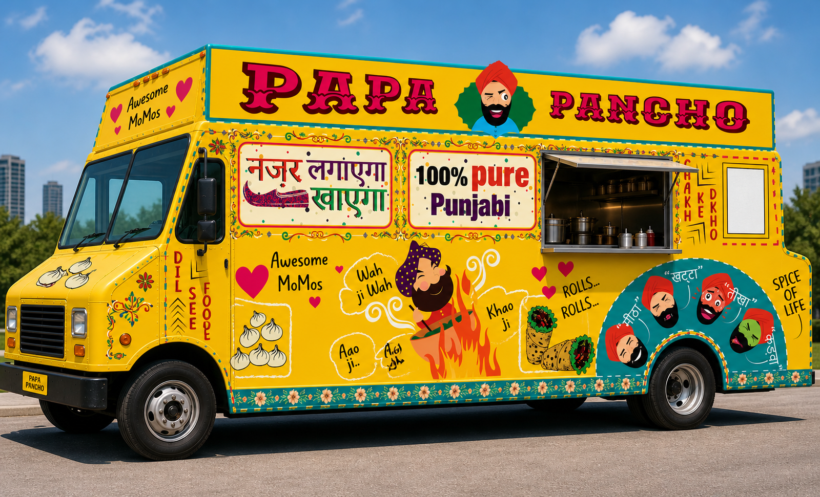
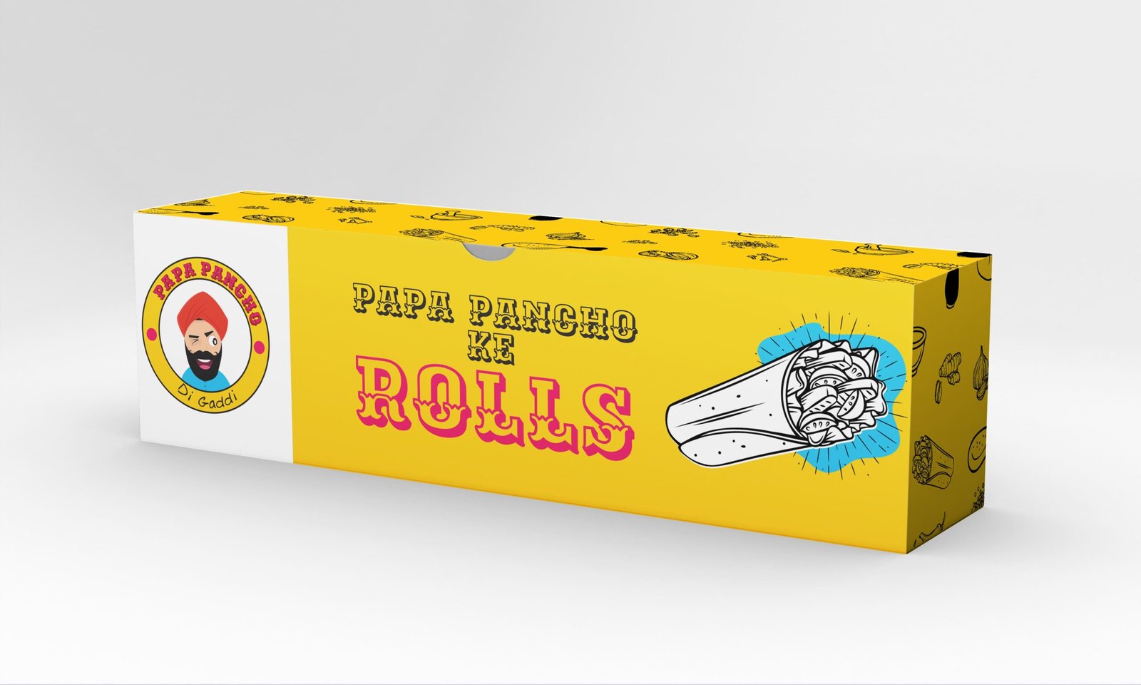
Papa Pancho Di Gaddi required an identity as expressive as the food itself—bold enough to create recall, yet systematic enough to travel across packaging, menus and daily communication.
Branding
Packaging
Food & beverage
Campaign design
01 · About the project
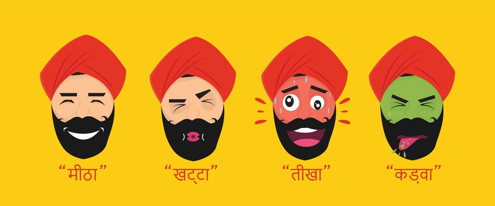
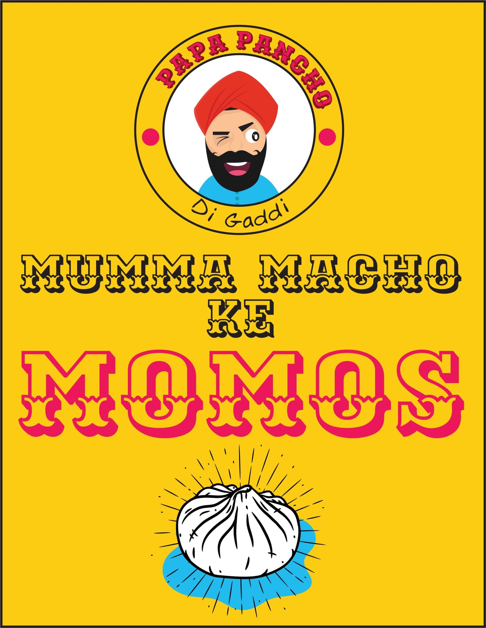
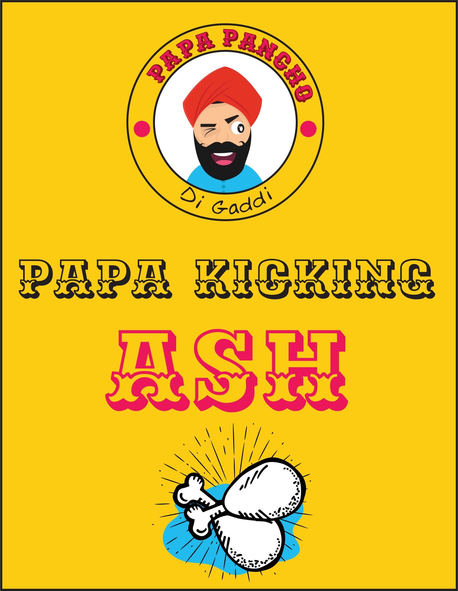
The brand lives in a fast, social and highly visual category. Rather than building the identity around a single logo moment, we created a broader kit of character, colour, typography and graphic devices. This gives every customer touchpoint the same lively personality while allowing individual products to remain distinct.
Project type
Client work
Services
Branding, Packaging, Food & beverage, Campaign design
Studio
Artgerms
Visual assets
8
02 · The challenge
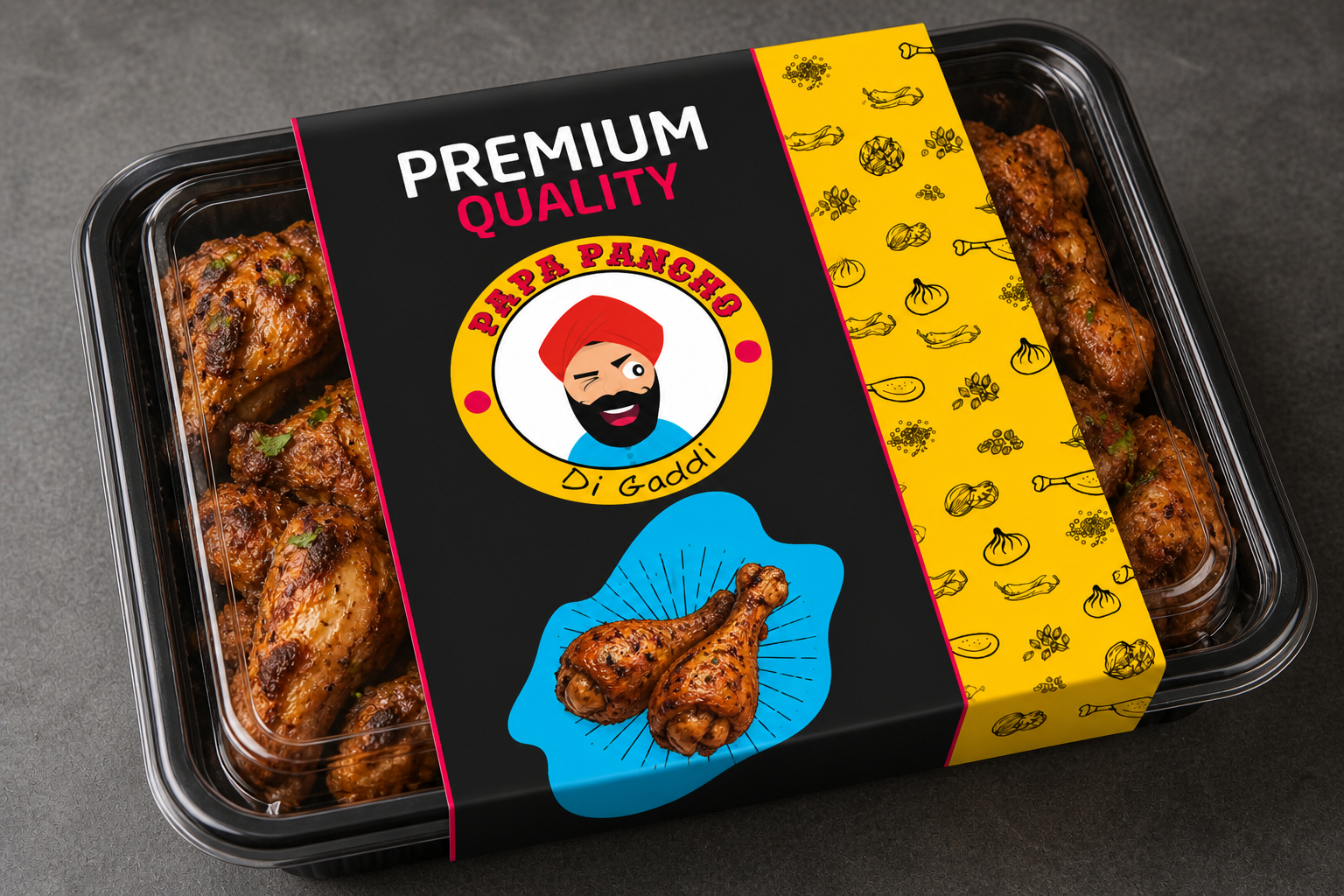
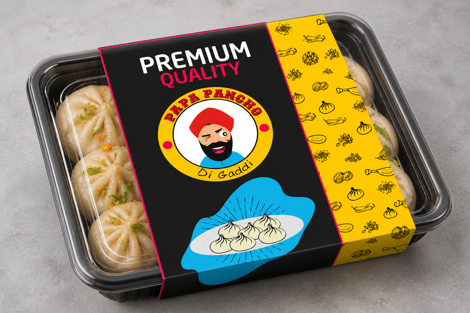
Food packaging has to work at several distances: attract attention from across a counter, communicate the product quickly and remain enjoyable when held up close. The identity also needed to express Punjabi humour and warmth without becoming a visual clichu00e9 or losing legibility across small formats.
03 · Design direction
A confident typographic voice, energetic colour relationships and playful branded elements create instant recognition. The packaging hierarchy separates appetite appeal, product information and brand expression, while repeatable layouts make it easier to extend the range. Campaign and environmental applications use the same ingredients at a larger, more expressive scale.
THE DELIVERED SYSTEM
01
Developed as one connected part of the project system, with consistency across every relevant touchpoint.
02
Developed as one connected part of the project system, with consistency across every relevant touchpoint.
03
Developed as one connected part of the project system, with consistency across every relevant touchpoint.
04
Developed as one connected part of the project system, with consistency across every relevant touchpoint.
04 · Outcome
Papa Pancho Di Gaddi now has a flexible visual language rather than a collection of disconnected assets. The system is designed to stay recognisable across takeaway packaging, merchandise, menus, social content and future product launches.
START A CONVERSATION
Tell us what you are building, where the challenge sits and what a useful result would look like. We will respond with the clearest next step.
01
Share your project and the outcome you need.
02
Receive a focused response and recommended next step.
03
Start with a clear scope, timeline and working rhythm.
Independent creative studio for brand identity, packaging, web design, UI/UX, performance creative and search visibility.
Working with startups, SMEs and growth teams across India and worldwide.
u00a9 2026 Artgerms. All rights reserved.
Creative strategy, design and digital execution in India.